
AR App
A mobile app that allows users to preview different Toyota vehicles in real-scale using Augmented Reality.
Client
Saatchi & Saatchi
Role
UX/UI Designer
Timeline
Dec. 2022 – Mar. 2023
(4 months)
Tools Used
Figma (For designing)
Maze (For user testing)
Overview
The Brief
Saatchi & Saatchi requested an app that leverages Augmented Reality to show a preview of how a life-size Toyota vehicle would look like in a specific location. This app would help Toyota scouters, producers, and creatives find and select the right location for a potential photoshoot.
Design Process

Empathize: Competitive Analysis
Existing App Analysis
Saatchi & Saatchi had an initial, beta version of the app with an unintuitive user experience and with various design and technical problems. Our first step was to see what the current app experience was like, and evaluate its main shortcomings.
Unintuitive UX
The app has little to no instructions or onboarding to teach users how to navigate and use the app, with a confusing user flow.
3D Model Limitations
Vehicle quality was low, and the experience was limited to only 1 test vehicle. There were also problems with having the vehicle being stable on the ground.
Outdated
The app does not meet the technical standards of today’s AR capabilities.
Competitive Analysis
As a starting point, we did a competitive analysis for apps similar to what our target users would use, and also for apps that use augmented reality. This analysis was key to allow us to understand what the industry standards are and to identify the minimum features our app would need to stay competitive.
Analyzing Similar Apps

Analyzing AR Apps

Initial Conclusions and Opportunities
Possible Permanent Features

Possible Toyota Specific Features
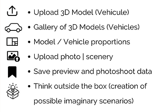
AR Opportunities
-
Changing properties (color, material, texture) from mobile
-
Add/modify lights that affect the object's appearance (offer predetermined options)
-
Tracking horizontally, vertically, or several surfaces at the time.
-
Real scale mode or customized size mode
-
Allow taking photos or videos and store in gallery by categories such as location, project, etc.
Empathize: User Interviews
User Interviews
To learn more about our users and their current experiences carrying out scouting, we set up 2 user interview sessions, organized as group open discussion done via Microsoft Teams.
Format
-
2 group sessions
-
10 interviewees (5 producers, 5 stakeholders)
-
Webex, open discussion
Interview Questions
We laid out a script with questions on the following key topics:
-
The scouting experience/process
-
Aspects to take into consideration when scouting
-
Technical aspects of scouting
Empathize: User Analysis
User Analysis
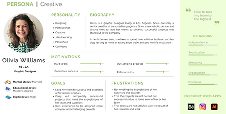
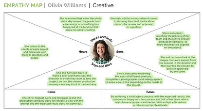
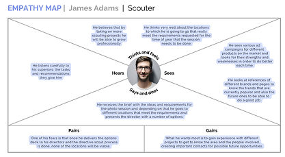
After on the interview sessions, we moved on to analyzing and breaking down what we knew about our users and their experience throughout the scouting process. We divided our users into 2 personas: Creatives and Scouters. This was crucial as it allowed us to consider their perspectives and experience as we designed the application.
User Analysis:
Creatives

User Analysis:
Scouters


Define
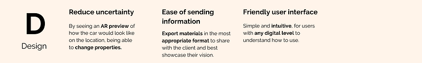
Insights and Opportunities
We identified different business and design opportunities, along with specific features and functionalities that could leverage these.
.png)
.png)

Final Requirements
We shared the initial requirements list to Saatchi & Saatchi stakeholders, and obtained their feedback and received a list of 4 of the highest-priority features to include in the app's first iteration.

Ideate
Initial User Flows
We then moved on to ideating different directions the tool could take based on our stakeholders' requirements list. We created the following user flows based on the main actions or objectives users would have, along with a breakdown of the steps they would take to complete these in the app.
Overall User Flow

Model Gallery User Flow

Information Architecture
With the initial user flow laid out, we were then able to define the Information Architecture of the app in a more comprehensive manner:

Low Fidelity Wireframes
Creating low-fidelity wireframes was crucial for us to quickly ideate and lay down potential layouts. We created sample screens for each step in the Information Architecture, and also laid out a sample of what the app would look like in a horizontal layout.

Prototype
Look & Feel
To start bridging the gap between low and high-fidelity wireframes, our team developed look and feel guidelines based on the Saatchi & Saatchi branding. These guidelines included details on the typography, colors, iconography, and even elements and components to use within the app. Having these was crucial to ensure our app felt and looked consistent.


Wireflow
During the design process, we realized that there were potential gaps in the experience, particularly in the onboarding phase. As such, to ensure all team members were aligned and to resolve these gaps, we laid out our existing wireframes into a wireflow.

High Fidelity Wireframes + Initial Prototype
After finalizing what the user experience would be like with the help of our wireframes, IA, and wireflow, we moved to creating high-fidelity wireframes. Compared to our low fidelity wireframes, these new ones now included the style and components we had laid out in our look & feel guidelines. We also created an interactive prototype of it in Figma, to be able to use it for our user testing and to evaluate our design.

Sample screens of what the high-fidelity wireframes/mockup looked like after implementing the look & feel guidelines.
Test
User Testing
Once we finished our initial interactive prototype, it was crucial for us to test our design and evaluate its performance and user experience. We decided to use Maze, since it allowed us to import our Figma prototype, combine it with different elements (like likert-scale questions, open-ended questions, and interactive missions), and obtain full reports and insights all in one place.
Test Objectives
-
Observe the prototype's performance and user experience.
-
Know our users' perspectives regarding prototype's design
-
Identify barriers, errors, or opportunities that may arise while using the prototype.
Methodology
-
Software: Maze (remote, unmoderated)
-
Users: 68 total, 18 – 48 years old
-
User Roles: Principal Creative Designers, Senior Creative Designer, and Creative Designer
User Test Breakdown


We linked our Figma prototype to Maze's test environment, allowing us to obtain detailed information as users completed different tasks, including task completion rate, amount of time taken per task, and even heatmaps.
Testing Insights
The onboarding and tutorial phase can be simplified.
Insight: Users felt the onboarding and tutorial was too long, with some of the written onboarding instructions going unnoticed, and with confusion regarding the app's main features.
Solution: Reword and simplify the tutorial, simplifying the introduction of the app's main features while also giving users the option to skip the tutorial and go back to it an any time.
App iconography is a bit confusing for users.
Insight: Most users were able to edit and customize the vehicle, and were also able to intuitively use the in-app gallery. However, there was some confusion between various app icons, where users mistook similar-looking icons for each other.
Solution: Work on the construction of the iconography to ensure they are distinctive. Conduct additional user-testing to validate the best layout + icon usage.
Test
User Testing (Round #2 - A/B Testing)
After presenting the testing results and communicating that the main revisions include reworking the app iconography, our clients requested a completely new layout for the AR preview mode. However, our team had worries regarding how the new, proposed layout could negatively affect the user experience. To resolve this, we proceeded to do a second round of user testing, an A/B test to identify which prototype layout was more successful.
Test Objectives
-
Measure the success of 2 different design layouts, to ultimately evaluate the optimum layout.
-
Evaluate the clarity of the app icons, and identify whether there are still any persisting issues.
Methodology
-
Software: Maze test (asynchronous, unmoderated)
-
40 users divided into 2 groups of 20
Prototype A
(Client's Request)
Prototype B
(Team's Suggestion)
_edited.jpg)
Left side: client's version. They requested the Help icon to be on the left of the camera icon, while the Model Library icon to be on the top-left. Right side: our suggestion, with the Help icon on the top-left and the Model Library icon next to the camera.
A/B Testing Insights
Prototype B > Prototype A
Insight: Overall, Prototype B (our team's suggestion) had a higher task success rate than Prototype A.
The icon layout and top-center button panel location was clearer for the user. Additionally, it also has benefits due to its scalability, since this layout can easily be adjusted to landscape mode.
The app iconography still needs some tweaks.
Users had no problems changing the color or looking for help in the app, validating that the 'color change' and 'help' icons are clear.
However, users still got the 'Gallery' and 'Add Image' buttons confused, indicating that it's necessary to further distinguish them.
Final Prototype
The insights and next steps defined thanks to our user testing ere crucial to help us veer our design to a more user-centered direction, and to solve the pain points we uncovered in our tests.

Interactive Prototype
Try out our Figma prototype here. For the optimum experience, view the prototype in fullscreen mode.
Viewing from your phone? Visit the prototype link directly.
Final Reflections and Takeaways
Overall, through a long, comprehensive process, we were able to design and deliver a coherent design that met our users' needs while also fulfilling our stakeholders' requirements. Some key takeaways from this experience are:
1. Get to know your users. The insights we gained through our user interviews and user analysis process was invaluable. They drove our initial decisions, the features to prioritize, and the direction the design took.
2. When in doubt, user-test. Doing 2 rounds of user testing was essential to helping us inform our design decisions, validate and justify them for stakeholders, and ensure our designs stayed aligned with our users' needs.
3. Iterate constantly. Every round of iteration allowed us to uncover and address usability problems early on, ensuring that the design gets closer to fulfilling our users' needs with each iteration.