
NYU Abu Dhabi Interactive Media Site Redesign
Designing and developing a new website for the Interactive Media program.
Client
NYU Abu Dhabi
Interactive Media Program
Role
UX/UI Designer
Web Developer
Timeline
Feb – Aug 2020 (7 months)
Tools Used
Adobe XD
Overview
The Brief
As a new major, the Interactive Media program was in need of a new, updated website that reflected its professionalism and creativity. To address this need, we ideated, designed, and developed a new website from scratch that was not only visually appealing and user-friendly, but was also easy to update and maintain.
Design Process

Empathize
User Interviews
To learn more about our users and their current experiences carrying out scouting, I set up 2 user interview sessions, carried out through Zoom.
Format
-
2 group sessions
-
12 interviewees (6 faculty, 6 students)
-
Zoom
Interview Topics
-
Current experience using the site
-
Information and content of interest
-
Areas of improvement / Magic Wand question
Define
Insights
Based on my conversations with our users, I identified the following key problems:
-
Students found it hard to find relevant information and resources. They usually had to click through different pages before they found the one they were looking for. Information was not organized and presented in an intuitive way, making it hard for students to find relevant information and resources.
-
Main web interactions were awkward and repetitive. A lot of them depended on hover interactions, which did not trigger on mobile and caused users to be confused regarding where they could find the information.
-
Various site elements were not optimized for tablet or mobile screens, reducing text legibility and providing a negative user experience. Users often wondered if the site was broken in mobile.
Define
Problem Statement
How might we enhance the program's website to ensure seamless access to key information for both students and teachers?
Ideation
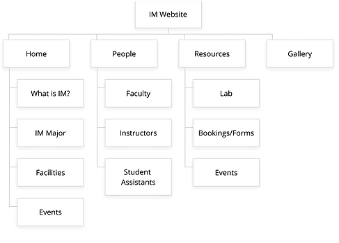
Information Architecture & New Sitemap
I identified the best ways to categorize and divide the different pages and content.
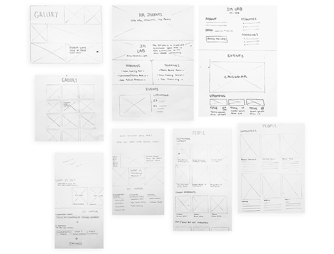
Sketches
Once the sitemaps were approved, I moved on to sketching. I created two potential layouts for the desktop version each page. Having two versions created room for more discussion and better feedback, since doing comparisons made it easier to identify which elements of the design worked, and which ones could be discarded.
Initial Design Decisions


Design
Wireframing
I moved on to creating low-fidelity mockups using Adobe XD. I created versions for mobile, desktop, and larger screens, to ensure from the get-go that the design was responsive.

Visual Identity


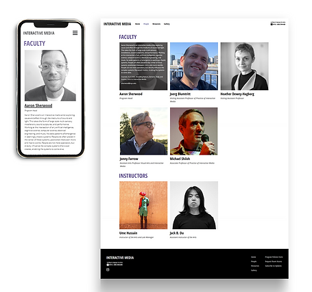
Mockups
Considering our key insights from the previous wireframes, I created the following mockups (for mobile, tablet and desktop), which would reflect how the actual website would look like.


User Testing
Testing
We tested and validated our design through usability testing. We carried out two rounds of remote unmoderated testing sessions (via a Qualtrics survey) where users evaluated the website’s user interface, design, overall content organization and layout, and responsive design. We tested on NYUAD students and teachers, as these were our main target audiences.
Testing Goals
-
Determine if the navigation and page organization is intuitive
-
Evaluate the effectiveness of each page’s design and content organization
-
Identify any cross-browser or cross-device issues
Testing Insights
-
The site's organization was easy to follow, with users being able to find specific information successfully.
-
Users mentioned that the overall design was clean and organized. The biggest problems arose when resizing the page or accessing the site in a mobile or tablet device, as there were layout inconsistencies.

Takeaways
Overall, through a long process of designing, testing, and iterating, we were able to successfully finish and deploy the website, fulfilling our project goals and addressing the initial problems we had identified. This process was a big learning experience for me, as I executed all steps from concept ideation to deployment with the guidance of the project manager, Jack B. Du, and the Interactive Media program head, Aaron Sherwood. Some final takeaways I got from this experience are:
-
Testing is essential. Carrying out our testing sessions was crucial to identifying key pain points that were unforeseen during the initial design and development process.
-
Constant iteration pays off. There is no such thing as iterating too much. Creating alternative versions of designs was especially helpful when gathering feedback.
-
Go back to the project goals every once in a while. Taking a step back from the details and reviewing the project goals allowed me to once again see the overall picture and gain more clarity